Brand, Product & UX System Design
Designing a unified habit-building ecosystem across brand, physical products, and a mobile app.
Role: Senior UX/UI & Brand Systems Designer
Company: Habit Nest
Industry: Wellness & Fitness
Platforms: Brand, Print, Mobile App, E-commerce
Timeline: Multi-year engagement
Team: Founders, Product, Development, Marketing
Scope
End-to-end
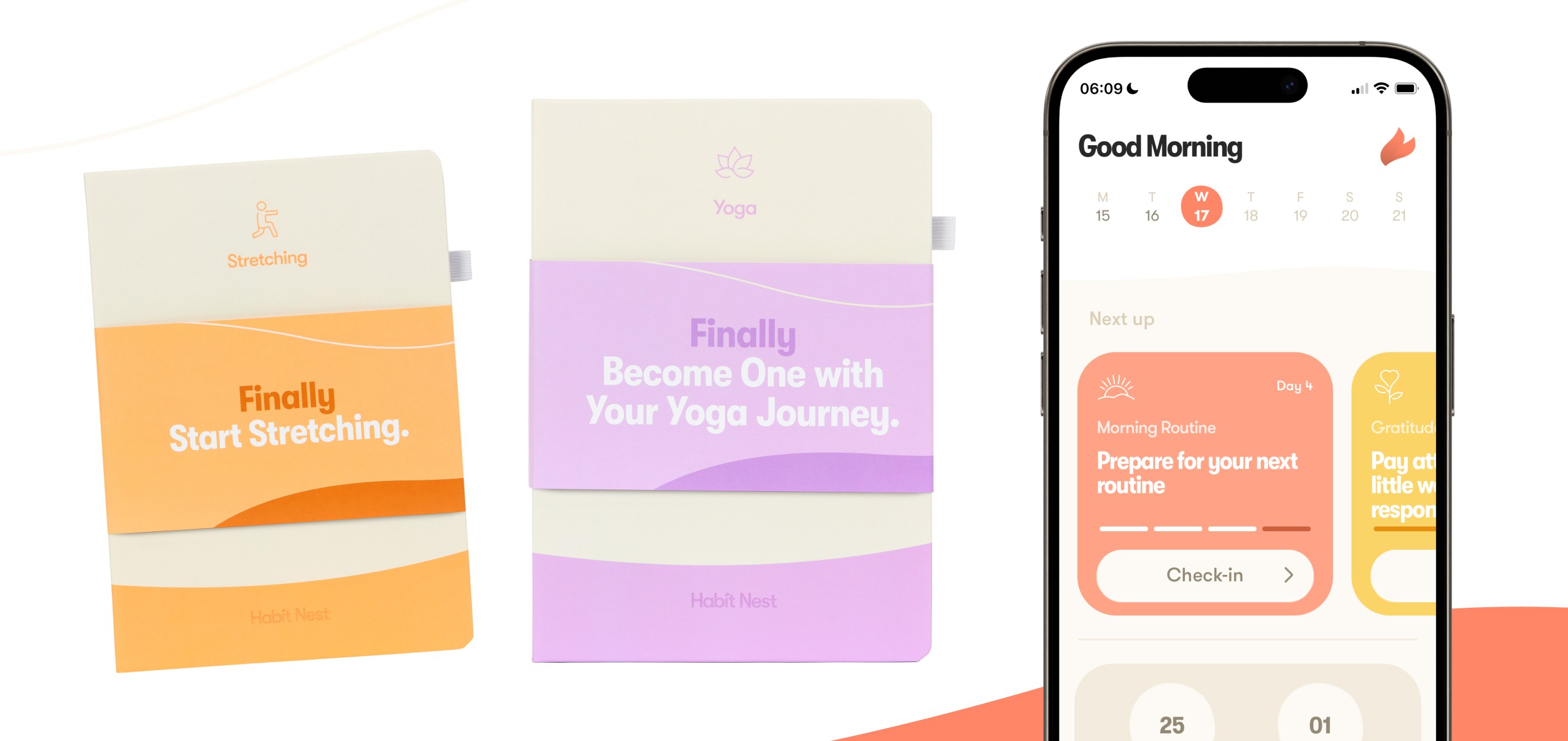
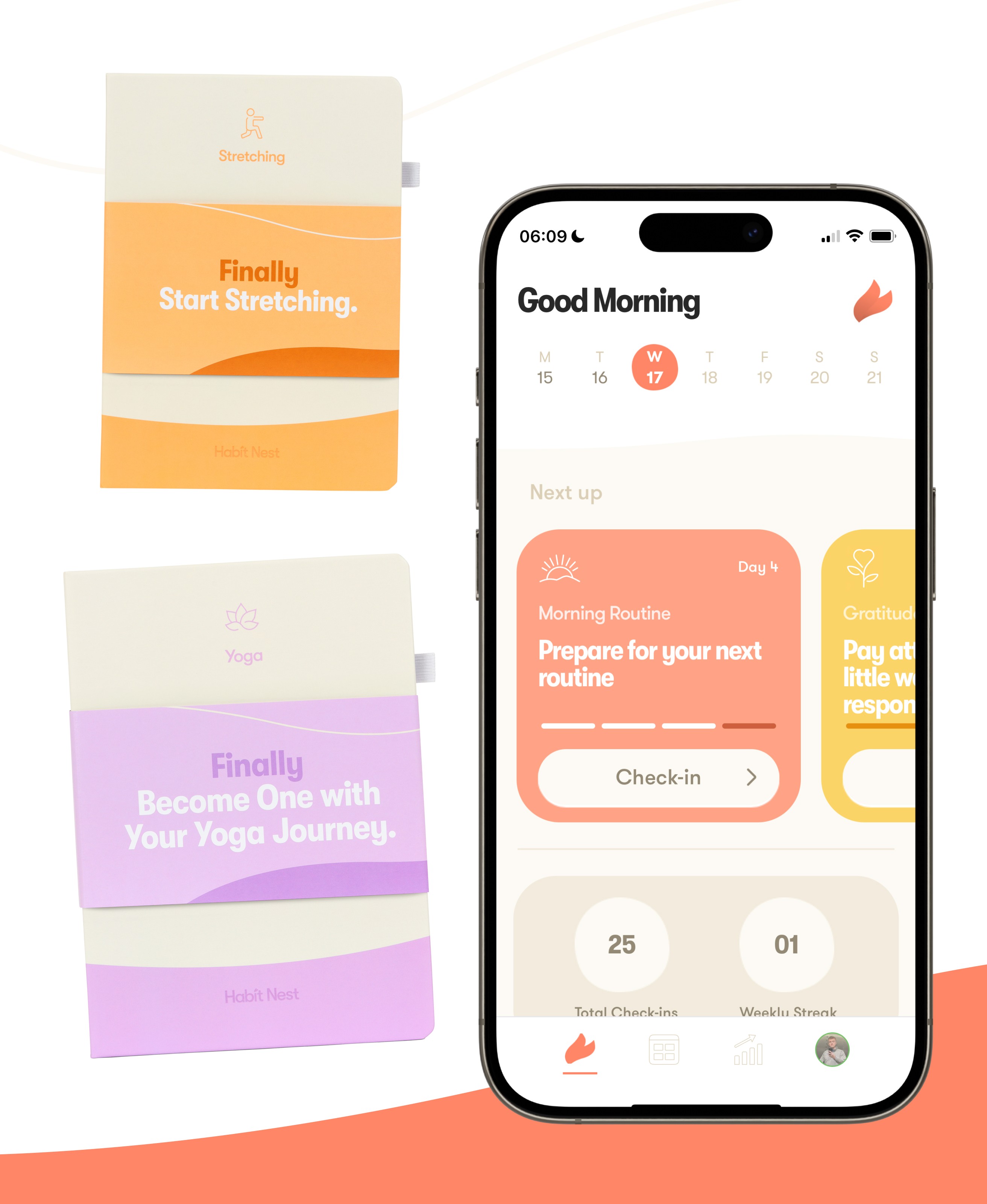
Owned the brand, journals, and mobile app as one connected system.
Reach
3 platforms
Unified across print, mobile app, and e-commerce touchpoints.
Longevity
Multi-year
Sustained engagement, adopted by the founding team as the standard.
Context & Problem
Habit Nest had built a loyal audience through its physical habit-building journals, but the brand and product ecosystem had grown fragmented over time.
As the business expanded across new products and platforms, there was a clear need for a unified brand system and a scalable product experience that could support long-term growth, consistency, and deeper daily engagement.
Role, Scope & Ownership
Led the end-to-end rebrand and product design strategy.
Defined the core brand system across digital and physical products.
Designed Habit Nest’s journals, UX patterns, and product architecture.
Led UX strategy and UI design for the Habit Nest mobile app.
Created scalable systems supporting future products and features.
Partnered closely with founders, developers, and stakeholders.
Brand Strategy & Identity System
Habit Nest’s mission is built around consistency and long-term behaviour change, but the brand had become fragmented across products and platforms.
Working closely with the founders, I led a full rebrand to create a cohesive visual and product system that could scale across journals, digital experiences, and future offerings.

Typography was designed as a shared system across print and digital, using consistent hierarchy and spacing to support quick scanning and repeat daily use. Legibility and rhythm were prioritised to keep the experience calm, accessible, and easy to engage with over time.
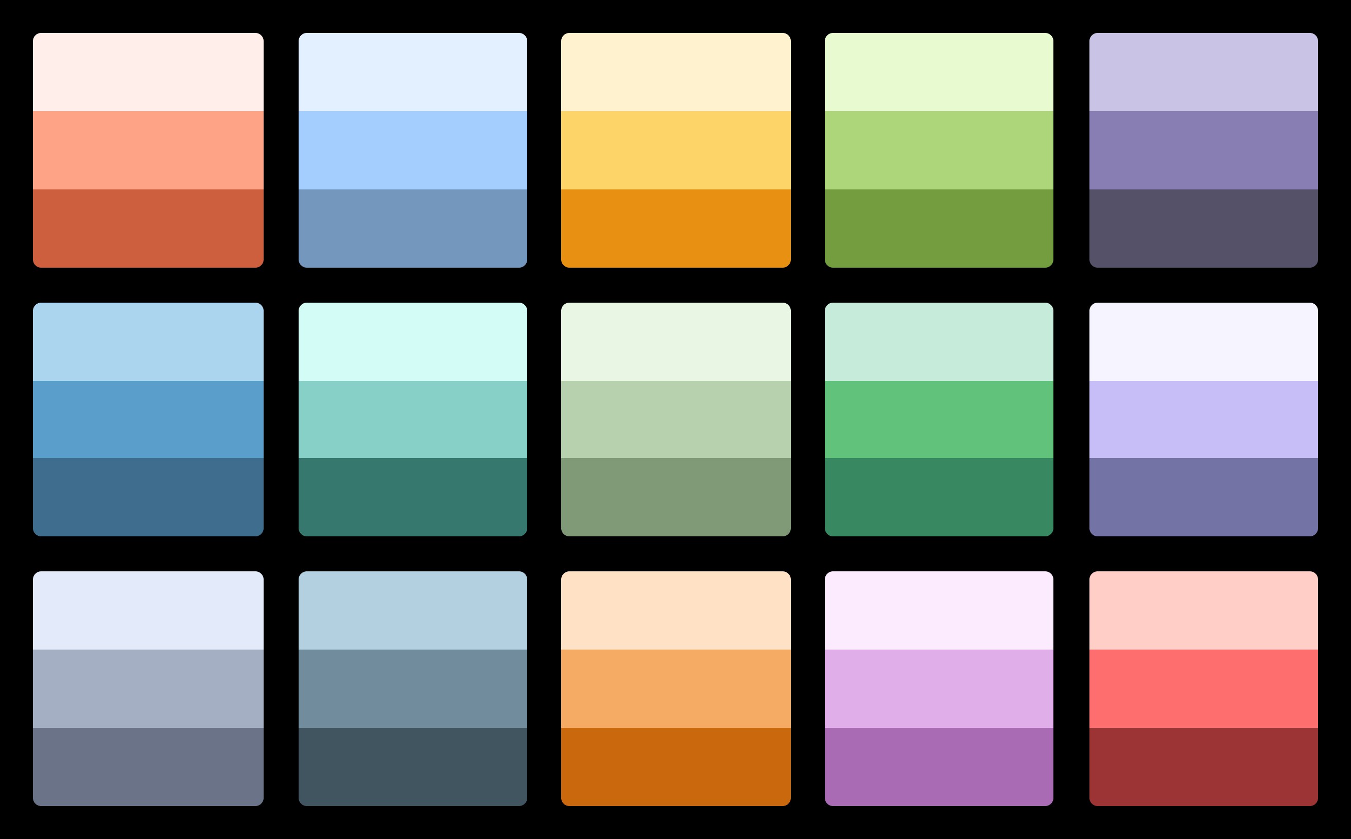
A diverse palette supports Habit Nest’s wide range of habit categories, using distinct colours to improve recognition and wayfinding across journeys. Colour is applied intentionally through consistent hierarchy and controlled intensity, keeping the experience focused while allowing the system to scale across programs.
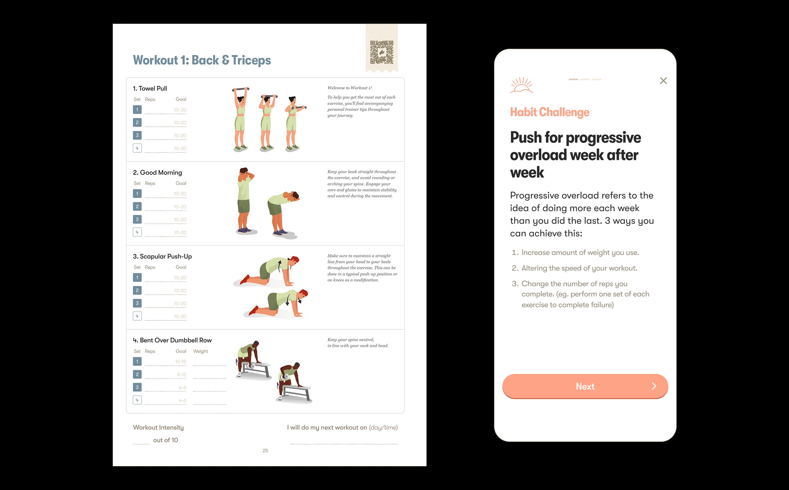
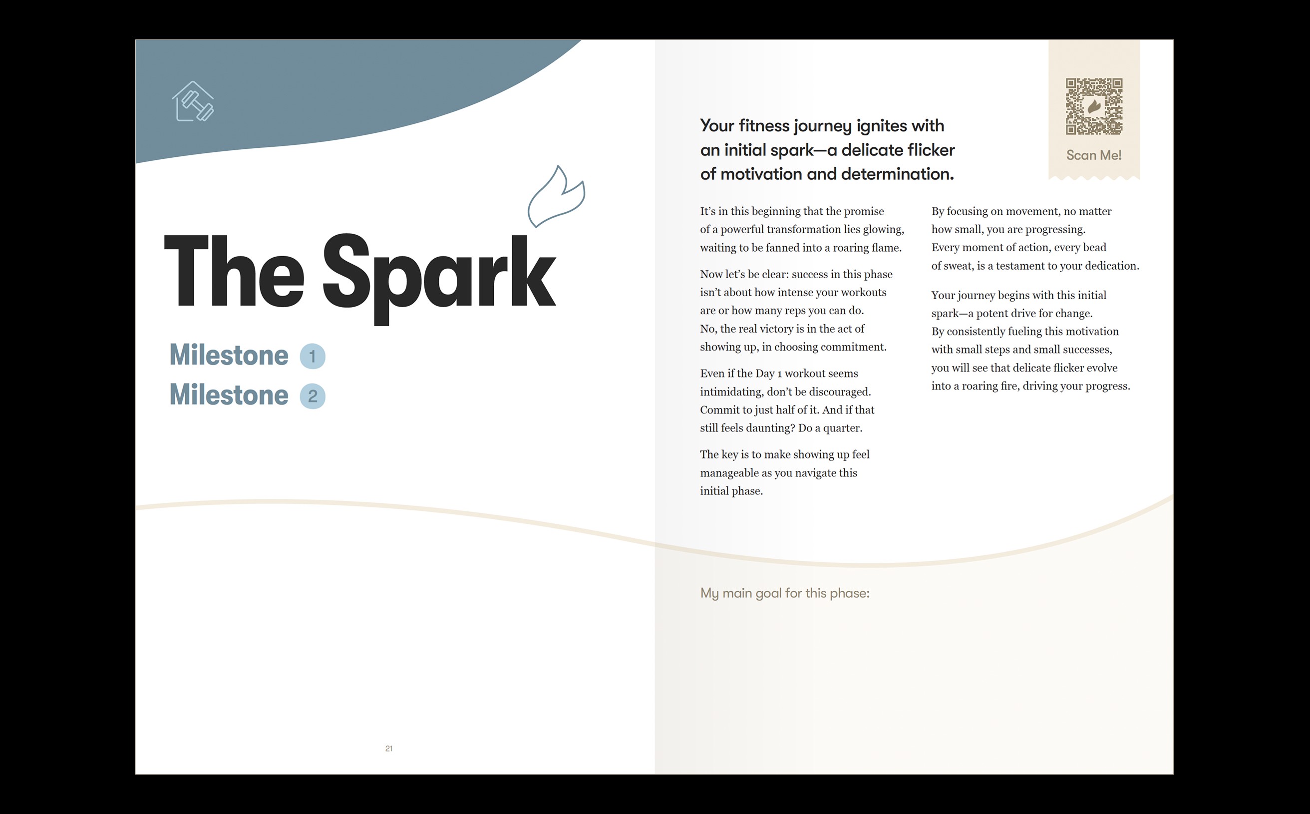
Consistent layouts prioritise daily actions, reduce cognitive load, and build familiarity through repetition.
Supportive, calm, and non-judgmental tone, designed to encourage long-term consistency without pressure.
Key decision
Category colour-coding over a single brand colour.
A multi-colour system lets each habit category own a recognisable identity, improving wayfinding as the range of programs grows. The tradeoff is a more complex palette to govern, so colour is held in check by consistent hierarchy and controlled intensity rather than left to run free.
Designing the Journals as a Behavioural System
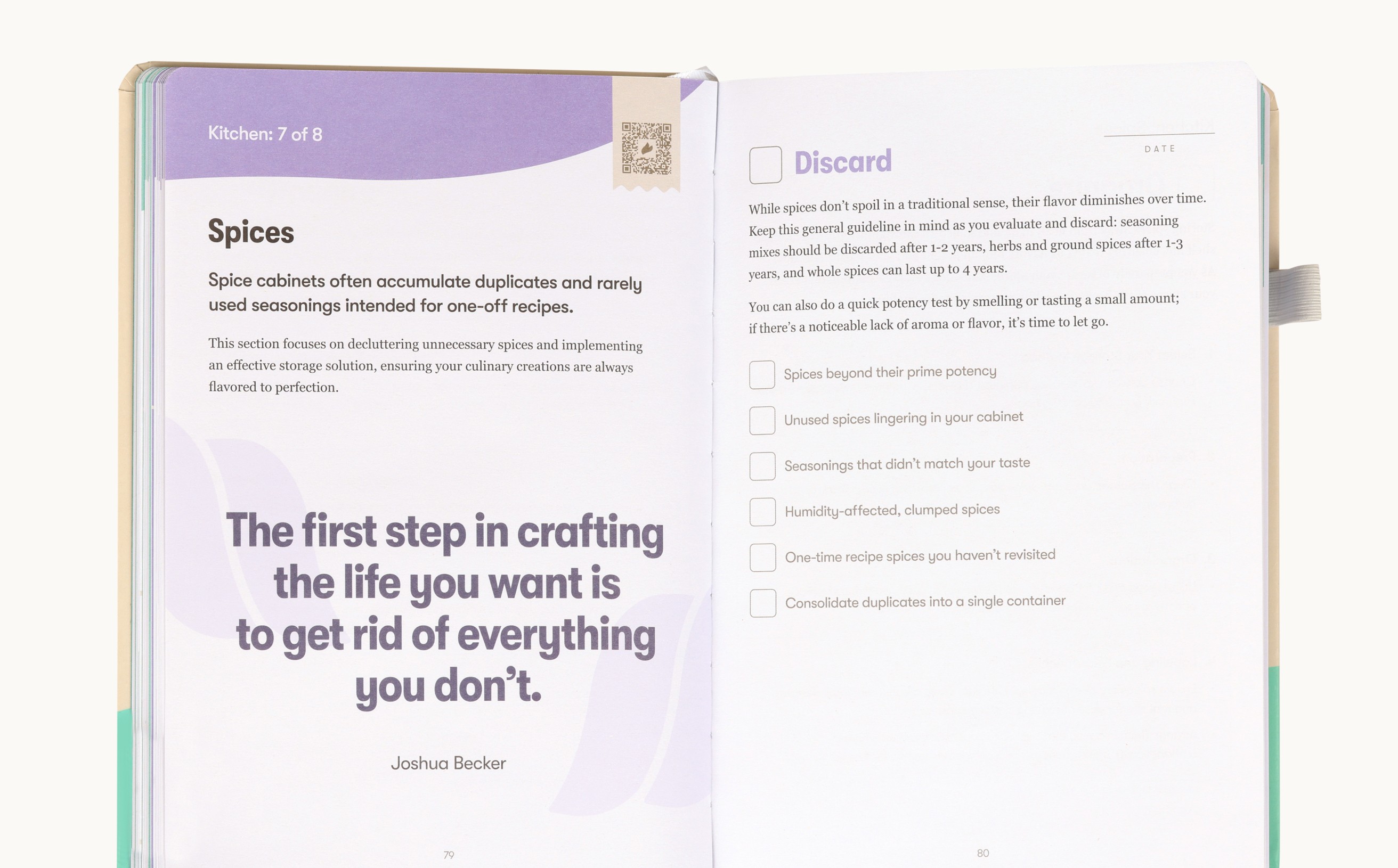
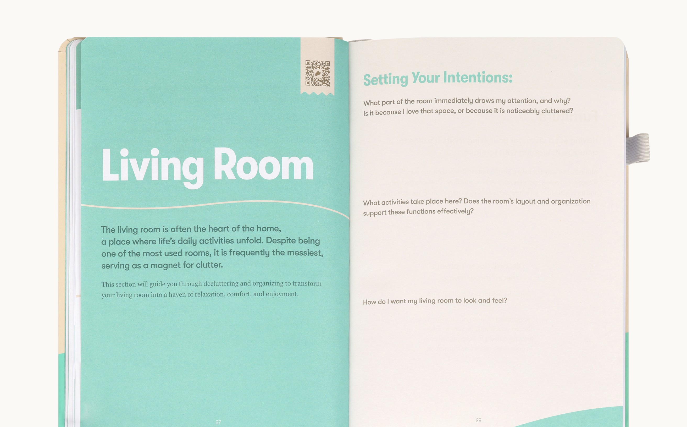
The journals were treated as a behavioural system, not just a printed product.
Layout, hierarchy, and pacing were intentionally designed to reduce friction, build momentum, and support daily habit formation.
Key decision
A repeating template system over bespoke layouts per program.
Consistent, repeating spreads build familiarity so users complete daily actions without relearning the page. The tradeoff is less novelty per program; the payoff is lower cognitive load and sustained momentum — the actual goal of the product.
Translating Physical Structure into Digital UX
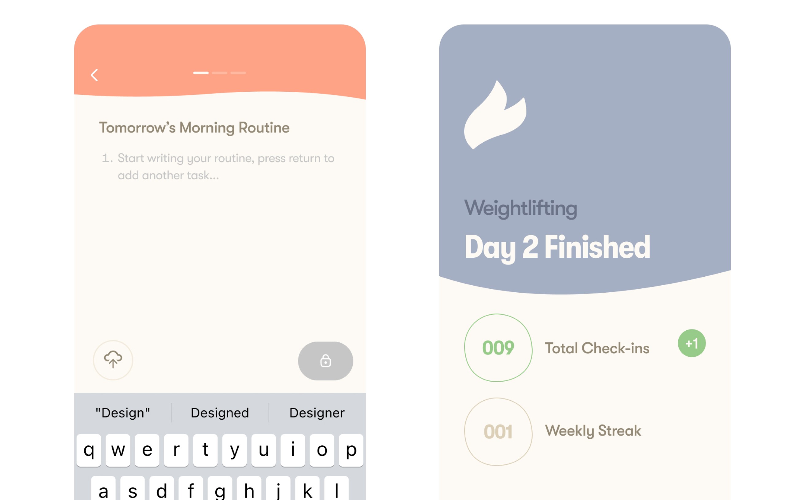
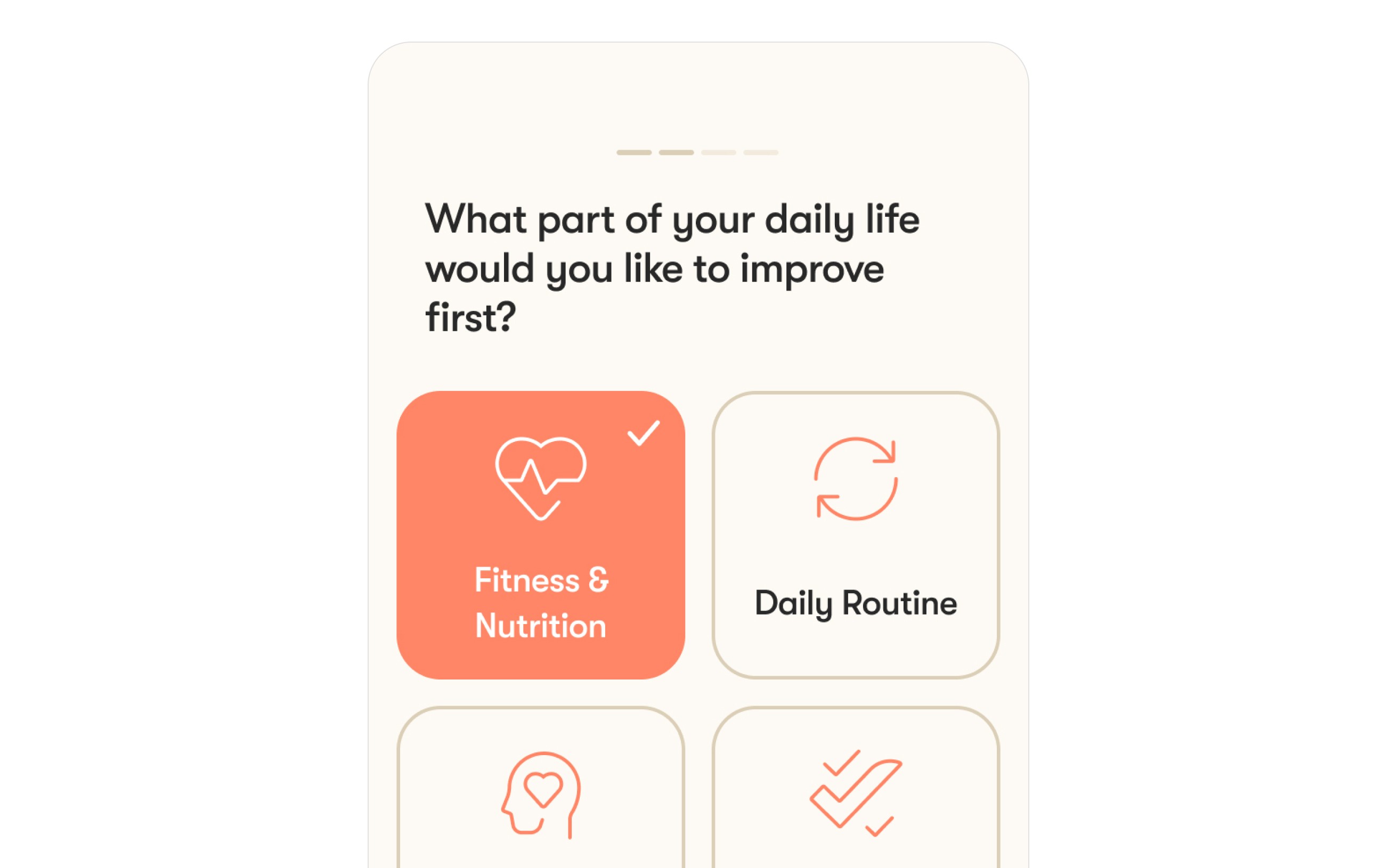
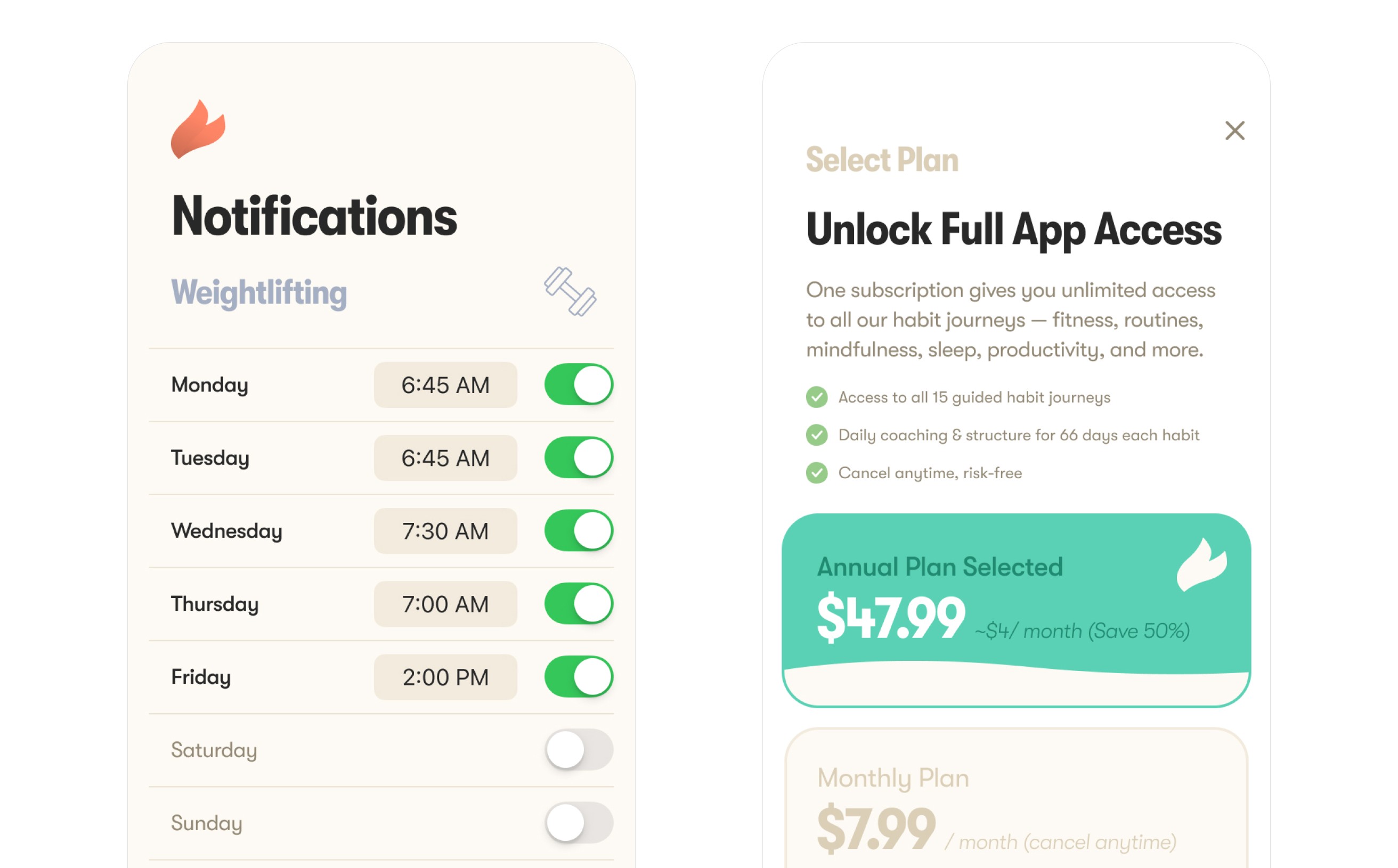
The app was designed as a direct extension of the journals. Preserving their structure, rhythm, and behavioural intent while adapting interaction for mobile.
Key decision
Mirror the journal's action-first structure rather than redesign for mobile-native patterns.
Preserving the journal's rhythm kept the behavioural intent intact across print and digital and made the app instantly familiar to existing users. The tradeoff is forgoing some app-native conventions; the gain is one coherent system instead of two competing ones.
App UX Strategy & Information Architecture
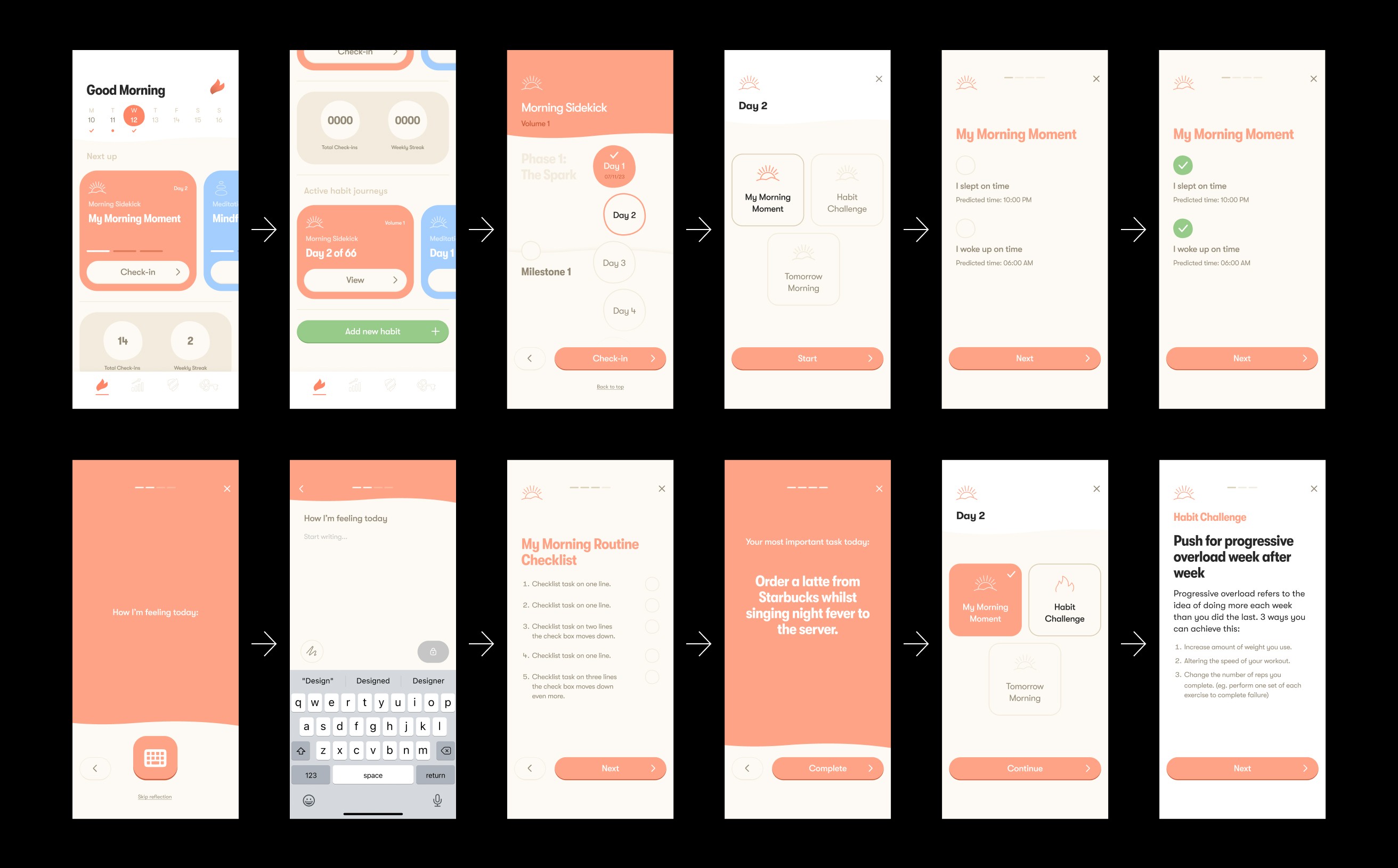
The app UX was designed to preserve the journal’s behavioural structure while adapting it for mobile use. The information architecture prioritised fast daily completion, clear journey structure, and scalable navigation across multiple habit categories.
Prioritised daily action as the primary loop (check-in → progress → reinforcement).
Organised content into habit journeys with consistent templates across categories.
Designed navigation to support quick return-to-task, reducing friction for repeat use.
Balanced structure vs flexibility, allowing users to personalise routines without losing guidance.
Built for scalability, ensuring new habits and features could be added without breaking the system.
UI System & Interaction Design
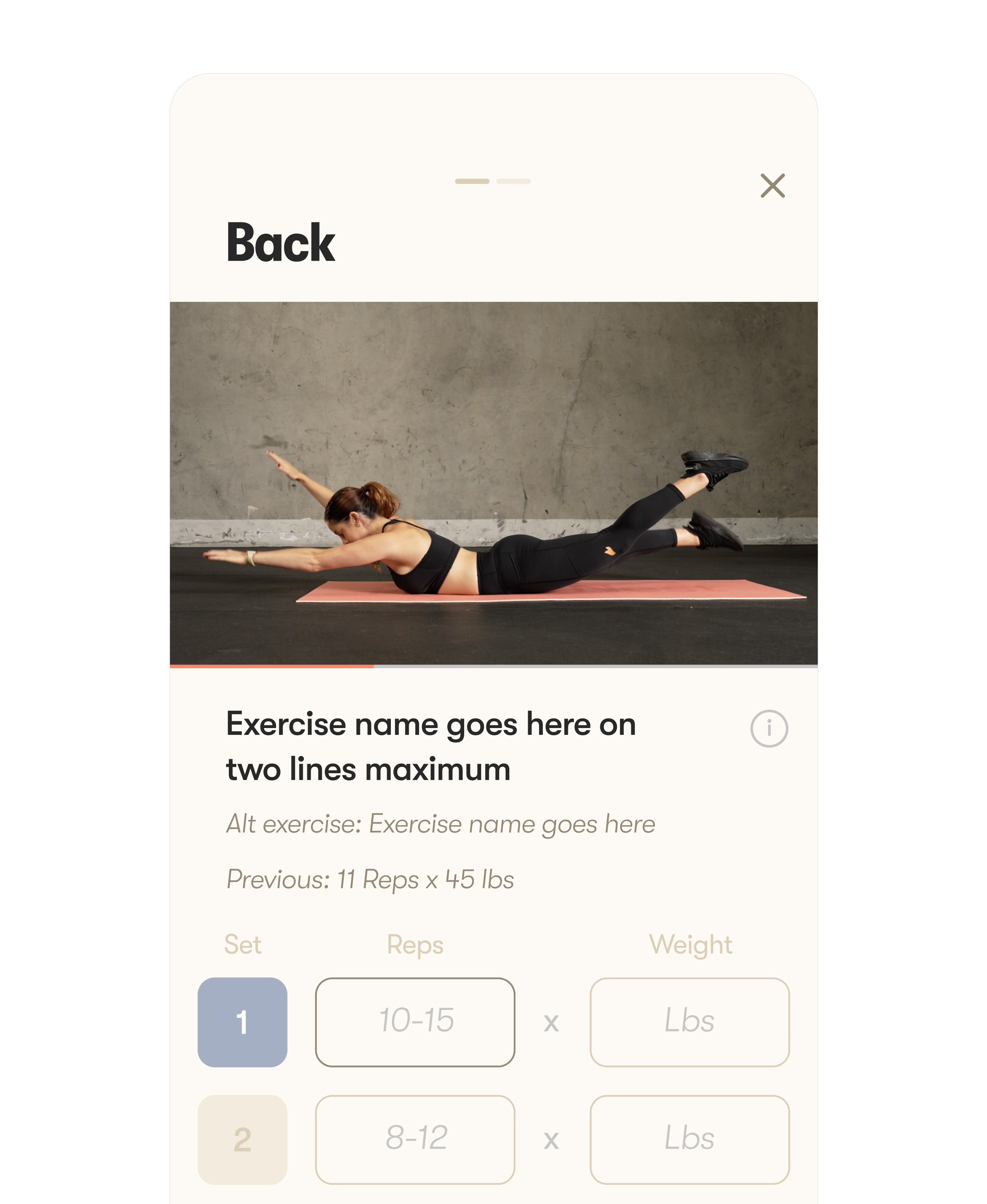
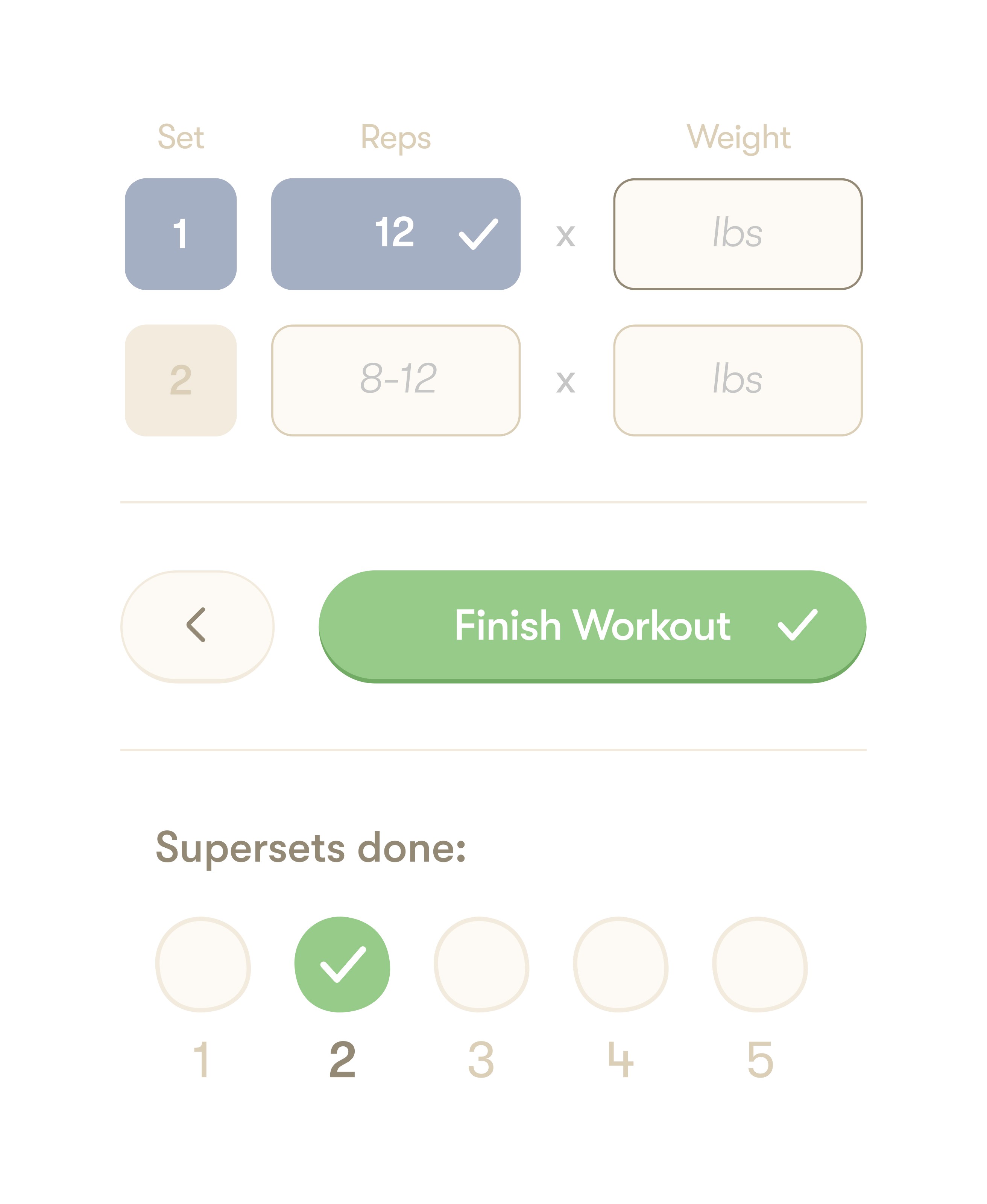
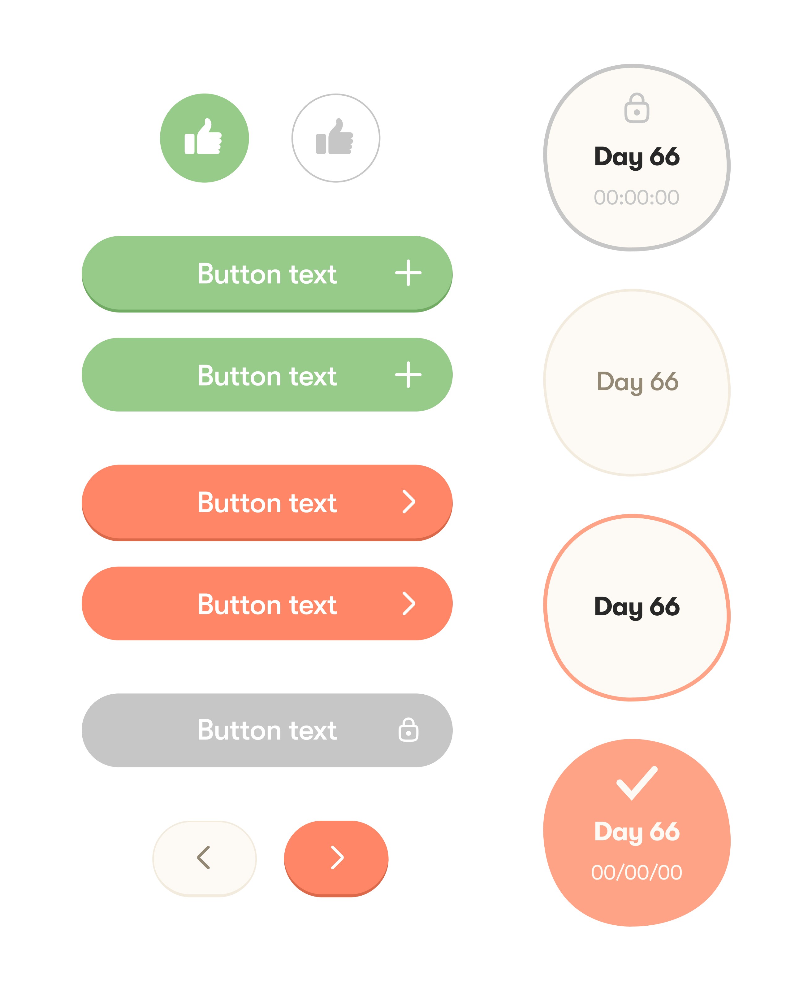
A unified UI system was designed to maintain consistency across habit journeys while reinforcing a calm, supportive tone. Components, layout patterns, and interaction rules were built to scale across new habits, features, and future product expansion.
Built a modular component system to support consistency across journeys and screens.
Clear typographic hierarchy and spacing rules support fast scanning and daily repetition.
Category colour supports recognition and wayfinding without overwhelming the experience.
Interactions prioritise single-focus actions, reinforcing calm pacing and clarity.
Designed feedback states (completion, streaks, progress) to reinforce motivation without distraction.
Outcome
The work replaced a fragmented set of touchpoints with a single, scalable system spanning brand, print, and product. Journal templates and app patterns now share the same structural logic, so new habit programs can be added without redesigning the experience. Adopted by the founding team as the operating standard, the system was built to absorb new products and categories as the business grows — supporting consistency and daily engagement over the long term.
Reflection
This project reflects my approach to senior design work: building systems that unify brand, product, and UX — designed to scale, evolve, and support real behaviour over time.