UX Redesign & Conversion System
Redesigning NutraBio’s eCommerce experience to increase sales and retention while evolving the brand toward a premium market position.
Role: Senior UX/UI Designer
Client: NutraBio
Industry: Supplements / eCommerce
Platforms: Desktop + Mobile
Scope: Full site redesign + conversion UX + retention flows
Team: Marketing, eCommerce, Development
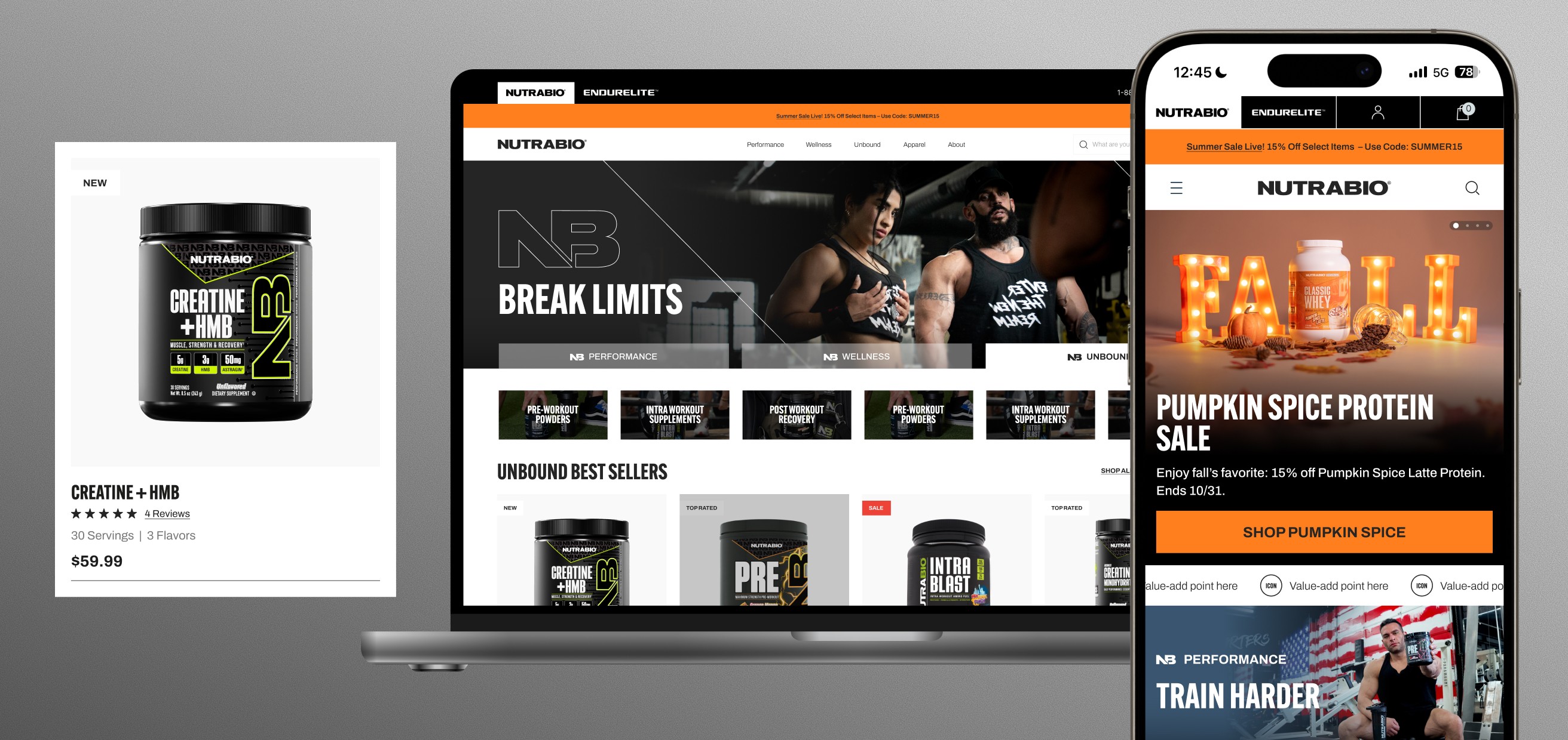
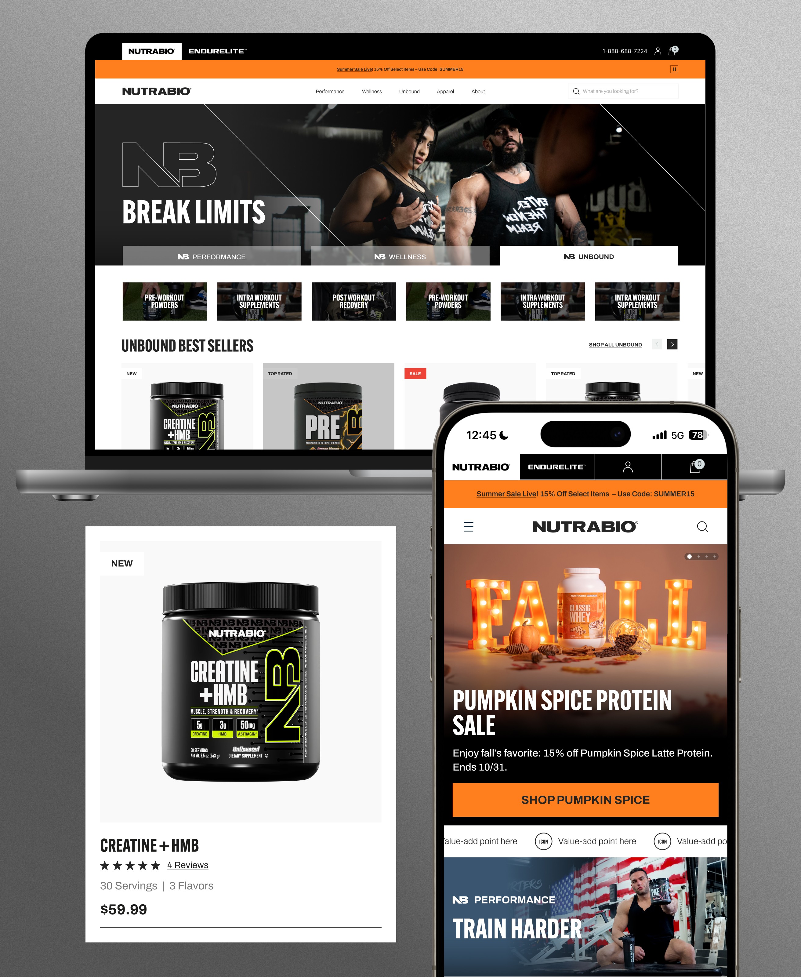
Scope
Full redesign
Desktop and mobile, from product discovery through checkout.
System
Scalable UI
Component templates built to carry future campaigns and product launches.
Focus
Conversion-led
PDP, cart, and subscription flows rebuilt around trust and retention.
Context & Problem
Nutrabio had strong products and market presence, but the existing website experience lacked clarity, modern credibility, and conversion-focused UX.
Product discovery and decision-making were fragmented, and the visual system did not reflect the premium scale of the brand or meet competitive expectations in the category.
Goals & Success Metrics
Improve conversion through clearer product hierarchy and reduced friction.
Increase retention by improving subscription + repeat purchase flows.
Elevate brand perception with a premium visual system aligned to competitors.
Improve product discovery, filtering, and category structure.
Build a scalable UI system for future promotions and product launches.
Role, Scope & Ownership
Led end-to-end UX/UI redesign across desktop + mobile.
Designed new component system and high-conversion templates.
Partnered with stakeholders + dev team for implementation feasibility.
Created information architecture and category structure improvements.
Improved checkout, cart, and subscription UX.
Premium Repositioning & Competitive Alignment
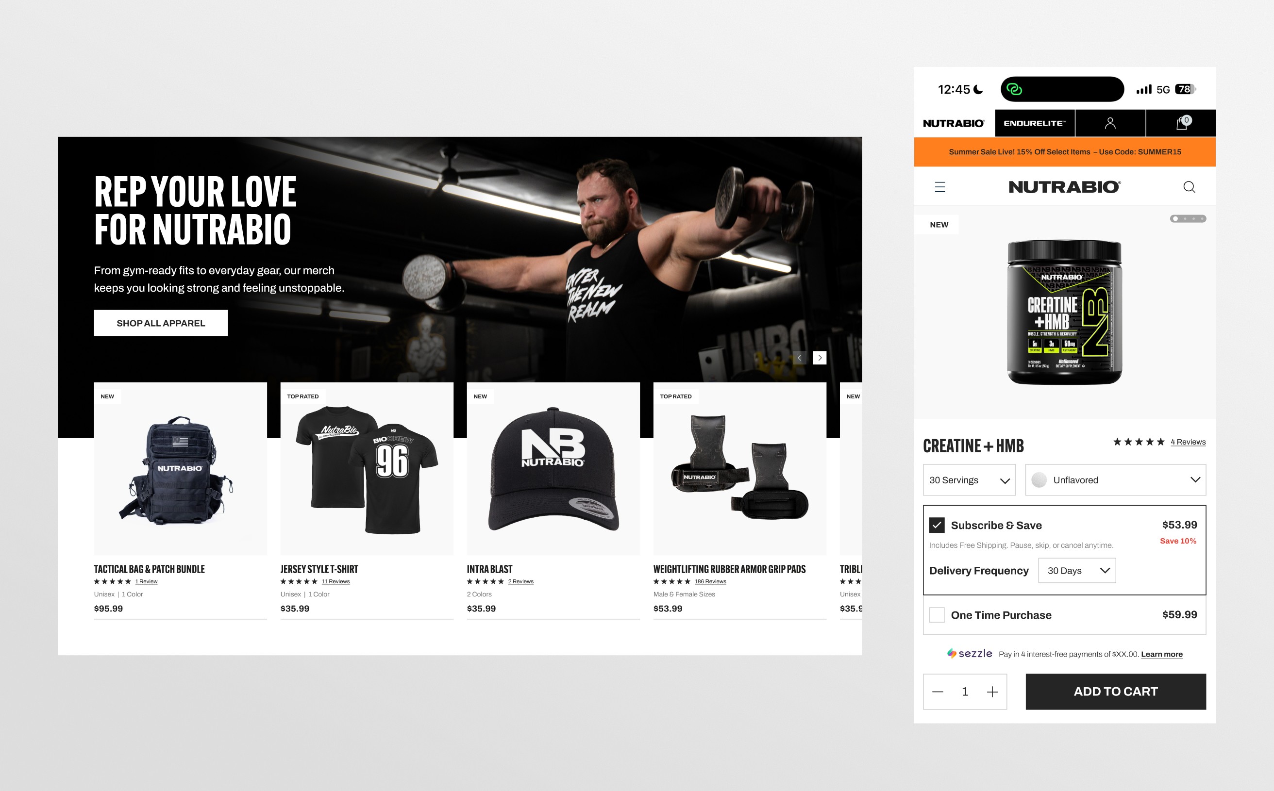
To match NutraBio’s scale and product credibility, the design system was updated to feel more premium and competitive within the supplement category. Visual hierarchy, typography, and spacing were refined to increase trust and clarity, while the overall UI language moved toward a modern eCommerce standard expected by high-performing competitors.
Key decision
Rebuild the visual system to premium-competitor standards rather than refresh the existing UI.
A familiar refresh would have been lower-risk, but it wouldn't have closed the credibility gap with category leaders. Rebuilding hierarchy, typography, and spacing was the heavier path — and the one that actually repositioned the brand as premium.
Product Discovery & Information Architecture
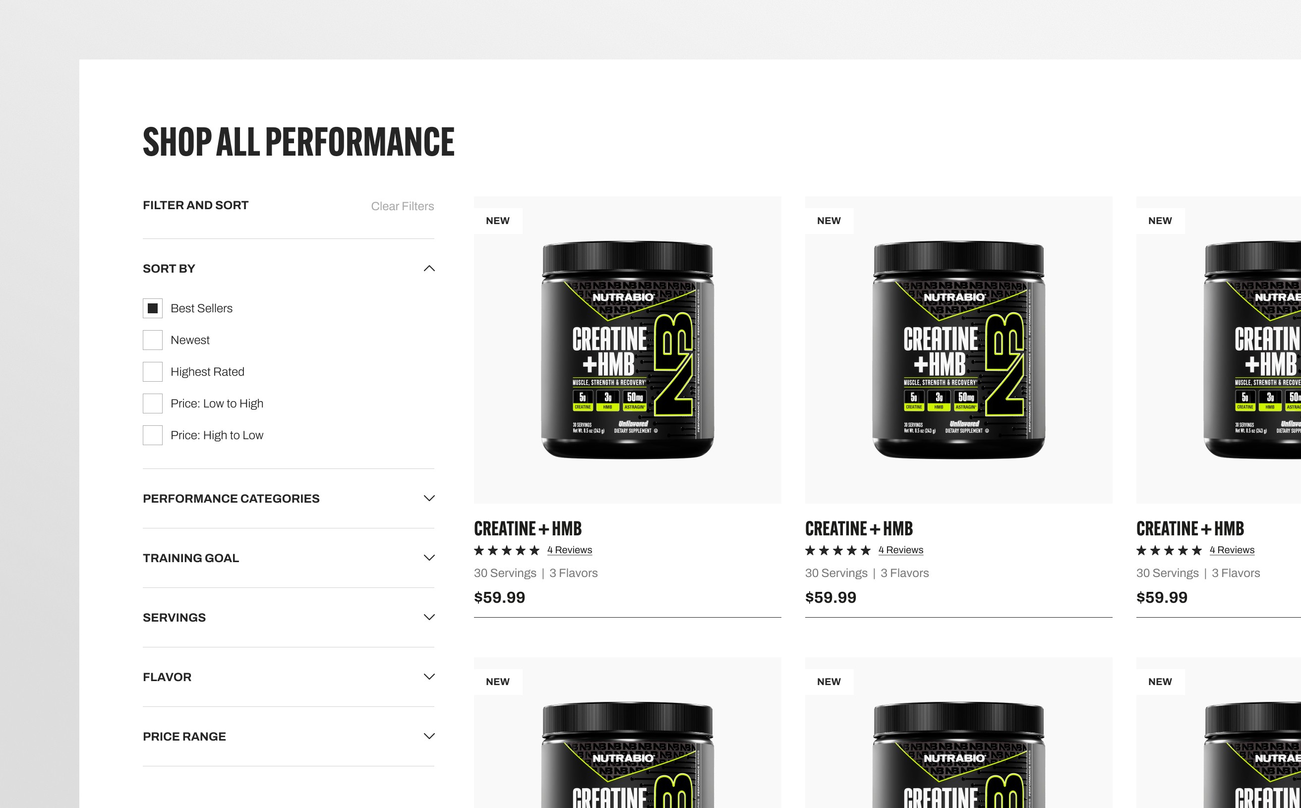
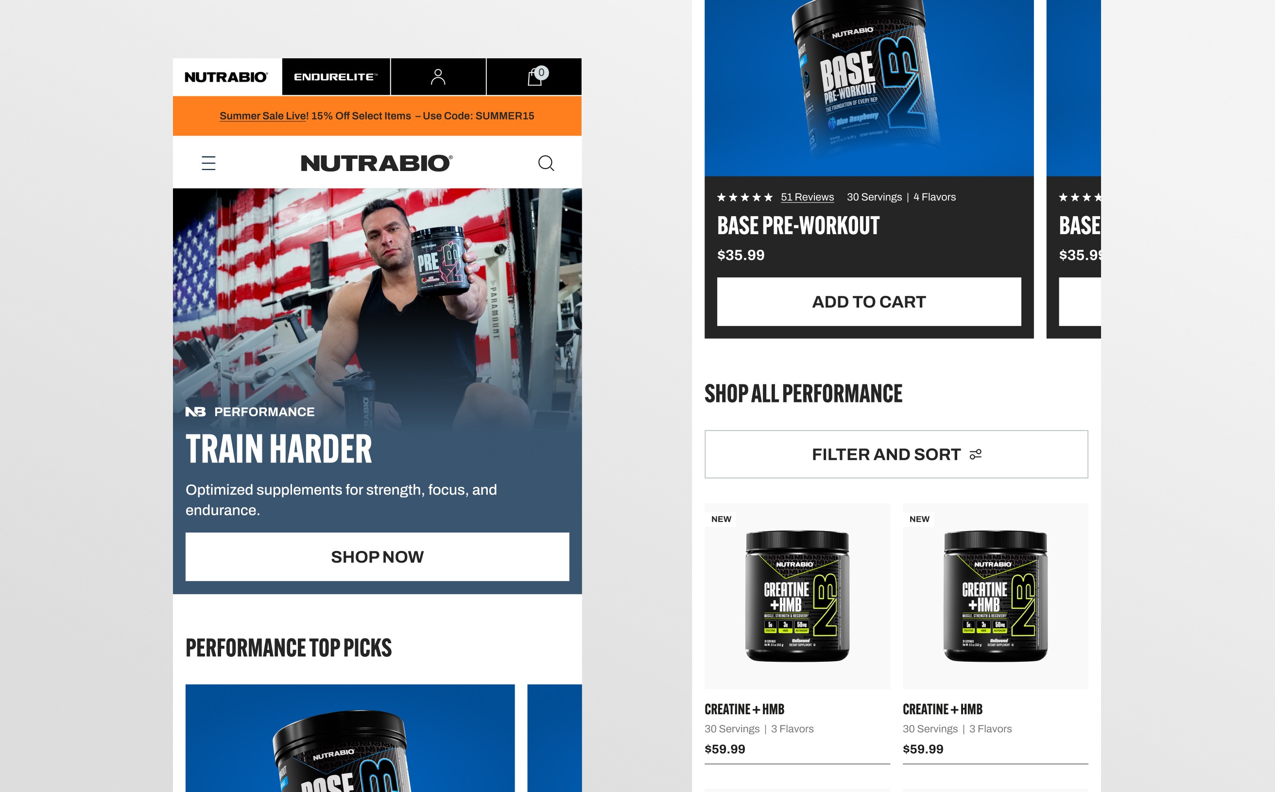
The product catalogue was redesigned to improve discoverability and reduce decision friction. Clear category hierarchy, stronger product cards, and filtering patterns help users compare products quickly and move into PDPs with more confidence.
Product Page UX: Clarity, Trust & Conversion
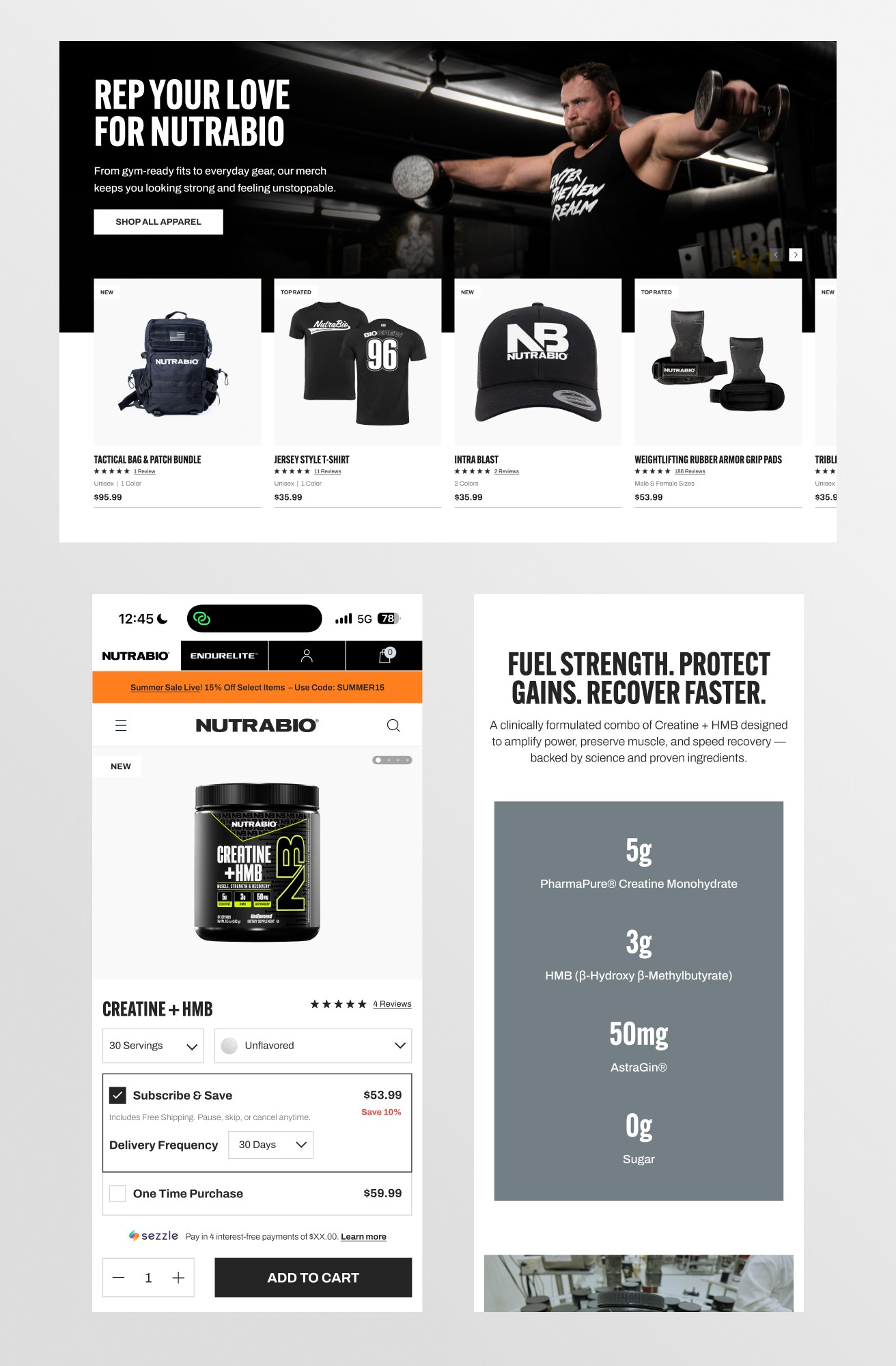
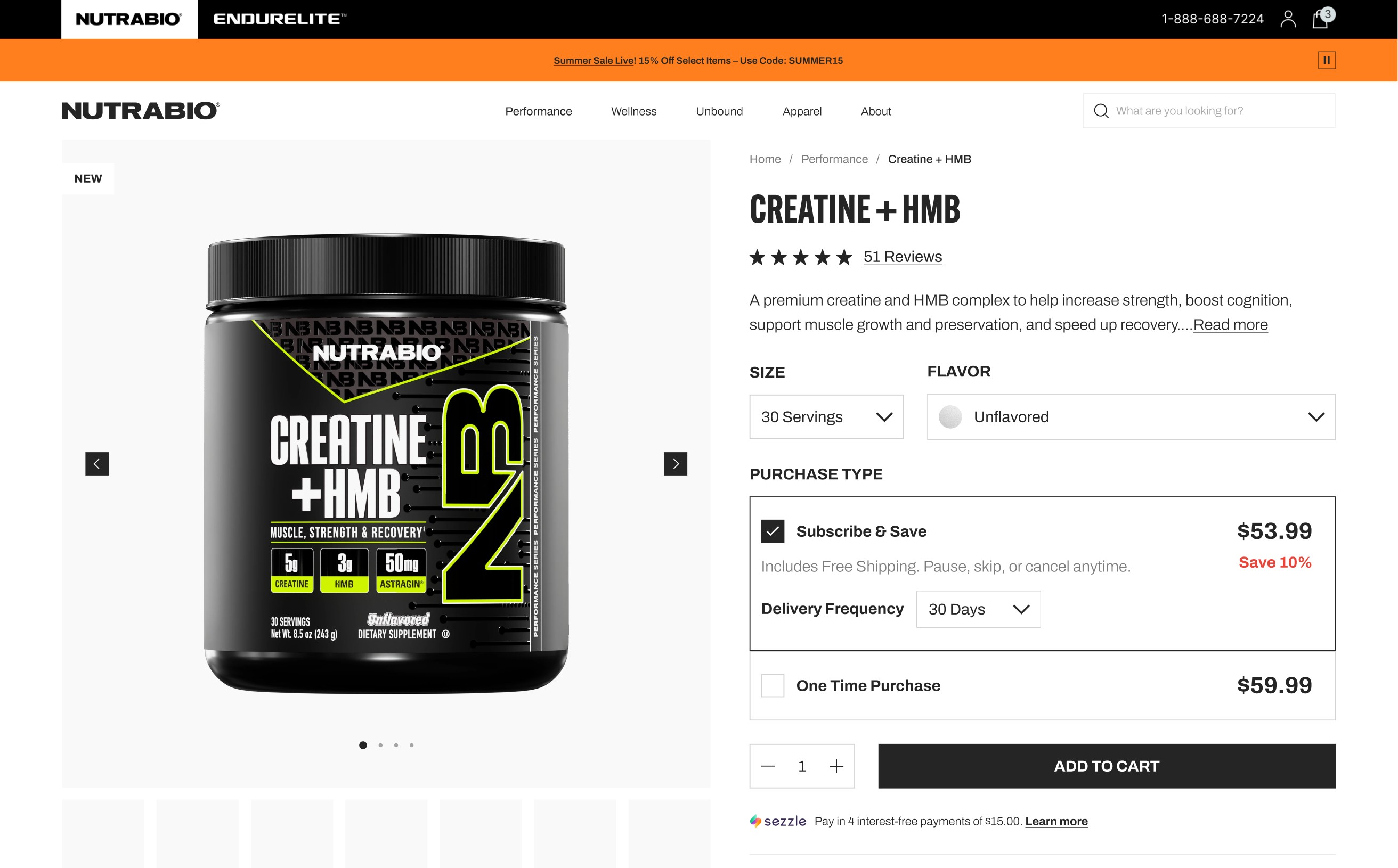
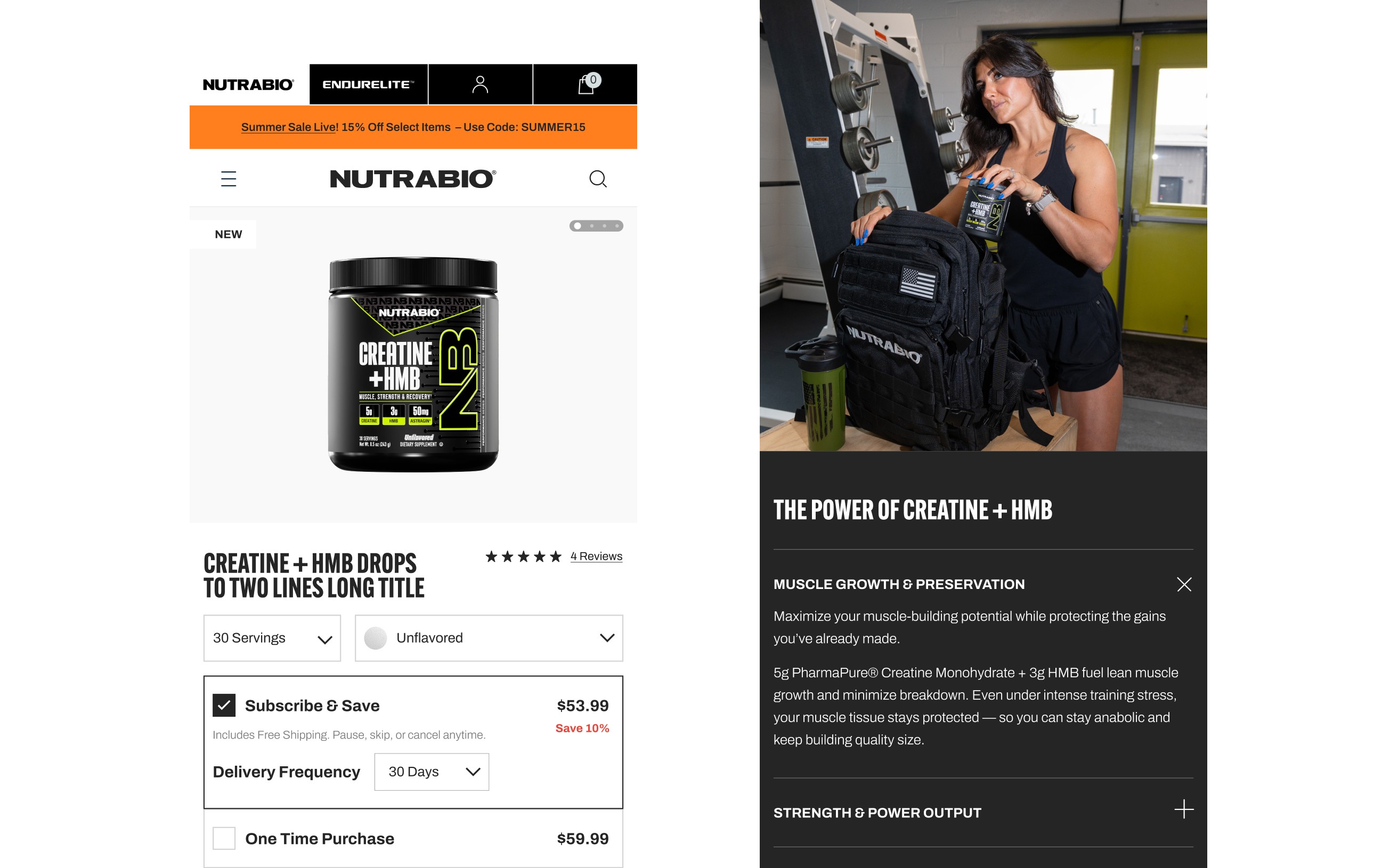
The product page was rebuilt to support trust-driven conversion — prioritising clear product benefits, ingredients, pricing, reviews, and purchase options in a structured hierarchy. The design reduces friction for both first-time and repeat buyers, while supporting subscription and upsell pathways.
Key decision
Lead the product page with trust and benefits over feature density.
Supplement buyers scan for credibility — ingredients, reviews, clear pricing — before specs. Prioritising trust signals and a structured hierarchy over packing in detail reduced friction for first-time buyers, at the cost of surfacing every attribute up front.
Cart & Subscription UX: Retention by Design
Retention was supported through a clearer cart experience and improved subscription mechanics. Subscription status, savings, and frequency controls were surfaced more clearly to reduce confusion and increase repeat purchase behaviour, while maintaining a clean and trustworthy checkout flow.
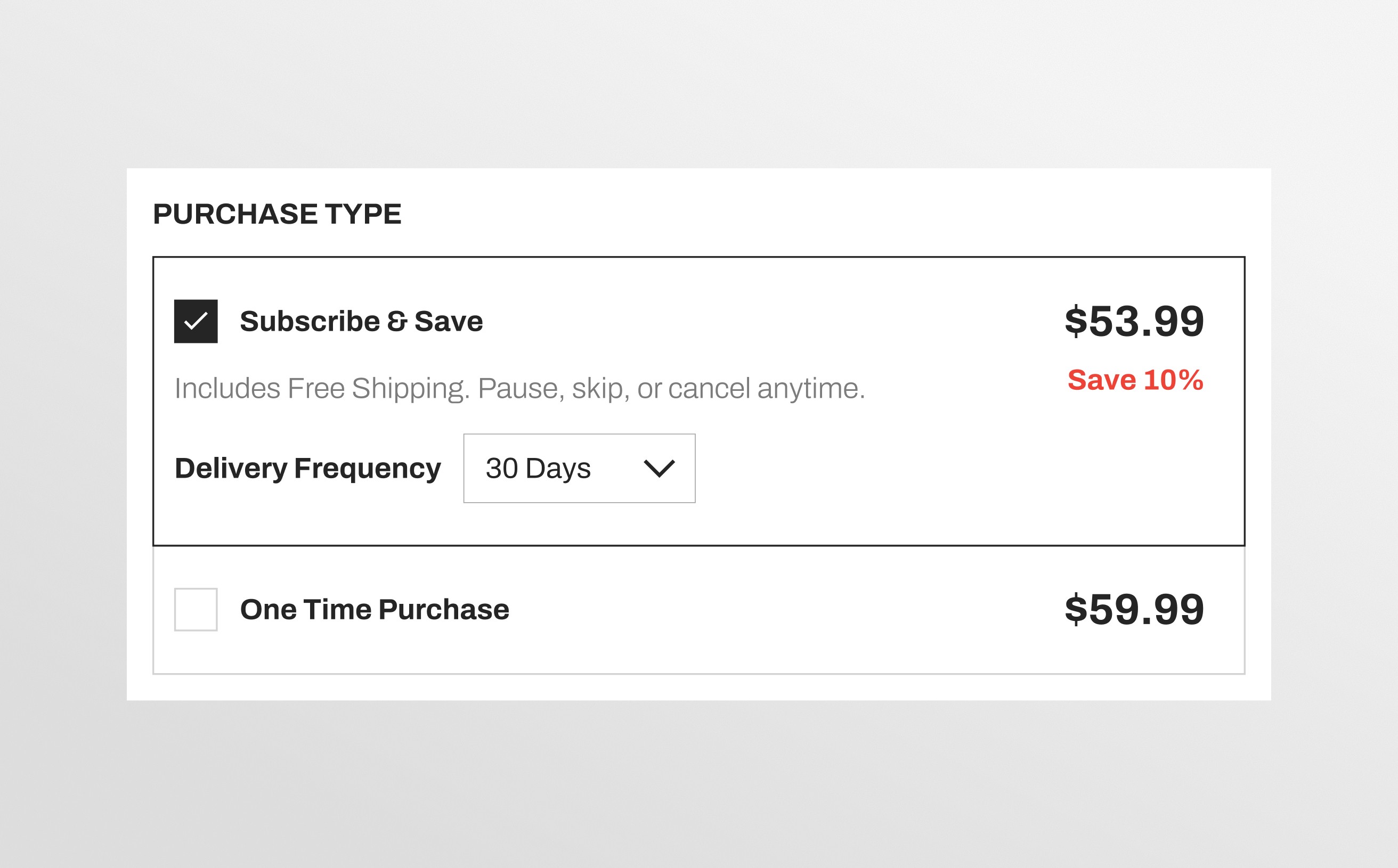
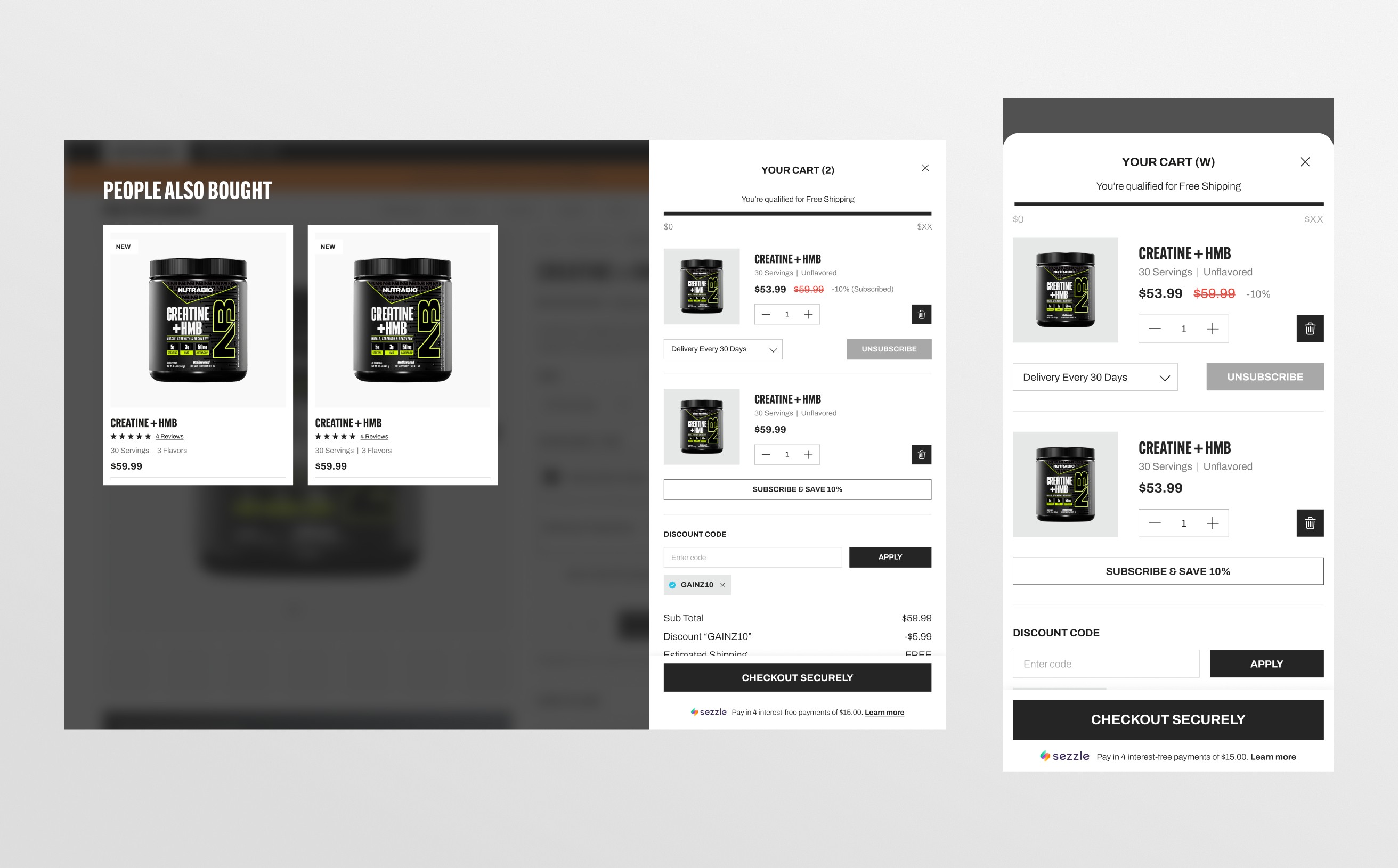
Key decision
Surface subscription value in the cart rather than behind checkout.
Showing subscription status, savings, and frequency earlier risked adding complexity to a clean cart. The tradeoff paid off — clearer repeat-purchase mechanics support retention without compromising the one-off checkout flow.
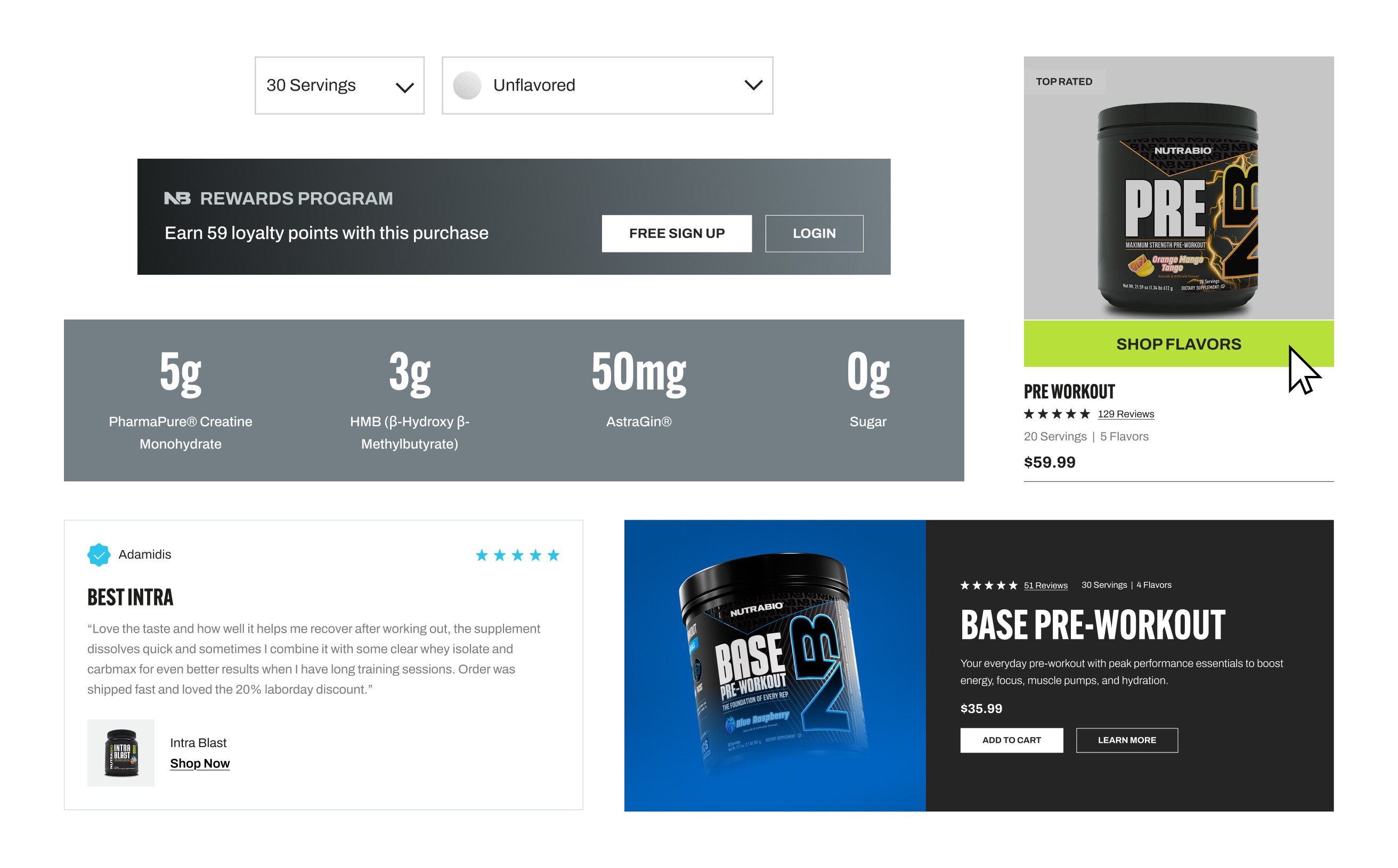
UI System & Component Design
A modular UI system was designed to support consistency across product pages, collections, cart, and promotional content. Components were built to scale across future launches while maintaining a premium, conversion-focused experience.
Outcomes
The redesign delivered a more premium, conversion-focused eCommerce experience aligned with NutraBio’s scale and market position.
Delivered a full eCommerce redesign aligned to premium category standards.
Reduced friction across PDP → cart → checkout.
Created scalable templates for future campaigns and product releases.
Improved product discovery and comparison clarity.
Strengthened subscription visibility and retention flow.
Reflection
This project demonstrates my approach to conversion-led UX: aligning brand credibility, product clarity, and scalable system design to improve outcomes across the full purchase journey.